
A green All-Share Index can make a red portfolio feel puzzling. The evening headline says Nigerian equities advanced, yet several of the shares on your watchlist finished lower. Both observations can be correct.
The explanation starts with how the benchmark is built. The Exchange describes the ASI as a value-weighted measure of movements in listed equities. Companies do not have equal influence: a price move in a large constituent can matter much more than the same percentage move in a small one. The Exchange’s equities guide explains this foundation.
That makes the index useful, but it leaves another question unanswered: how widely was the day’s gain shared?
A simple example of a narrow rally
Consider an imaginary market in which one company represents 30% of the index. Its share price rises 4%, while the rest of the market, collectively, falls 0.5%. Ignoring index adjustments, the large company adds about 1.2 percentage points and the other companies subtract about 0.35 points. The index still gains roughly 0.85%.
Those numbers are illustrative, not current NGX weights. They show why the percentage change beside the ASI cannot tell you whether the typical share rose. They also explain why holding ten companies does not necessarily produce anything close to the benchmark’s return.
Count the gainers and losers
Market breadth measures participation. The simplest version compares the number of advancing shares with the number declining over the same period. If 20 rise and 40 fall, the advance-to-decline ratio is 0.5 and the net count is minus 20. Both describe negative breadth, although the ASI could still finish higher.
Be precise about the measure. A report may use a ratio, a net count or the percentage of traded shares that advanced. These figures are not interchangeable. Check whether unchanged shares are included in the denominator and whether the comparison covers one session or a full week.
This divergence occurs in practice. An August 2026 market report republished by NGX described a 1.21% ASI gain alongside 23 advancing and 36 declining stocks. The point is the coexistence of a stronger benchmark and weaker participation, rather than a trading signal from that single session.
Then ask where the money traded
A broad list of gainers tells you more than the headline alone, but the quality of that participation still matters. A small price increase on very little trading carries different information from sustained activity across several liquid companies.
Read turnover value alongside share volume. A million low-priced shares can create a large volume number while representing much less money than a smaller trade in an expensive stock. A single negotiated transaction can also dominate the day’s totals without demonstrating widespread buying enthusiasm.
Look across sectors too. Banking shares might be weak while industrial or consumer companies carry the benchmark. The NGX indices page provides a starting point for comparing market segments. A sector index also has its own construction and concentration, so avoid treating it as an equal-weighted vote by every company in that industry.
What this means for your portfolio
Before deciding that your holdings are underperforming badly, compare like with like. Use the same starting date, account for cash you added or withdrew, and recognise that a price-index change does not capture your personal dividend receipts, dealing costs or tax position.
Next, examine your exposures. A portfolio containing several banks may still depend heavily on one set of economic conditions. An index led by a company you do not own will naturally produce a different result. The useful question is whether your holdings are behaving consistently with the businesses and risks you chose.
A practical market-reading routine takes three passes:
- Read the ASI change to establish the benchmark’s direction.
- Check gainers, decliners and sector performance to judge participation.
- Review turnover and your own sector weights to understand the difference from your portfolio.
One day of poor breadth does not prove a reversal is coming. Repeated narrowing, however, gives you a reason to investigate earnings, valuations and concentration more closely. The ASI remains a useful headline. Breadth helps you understand what happened underneath it.
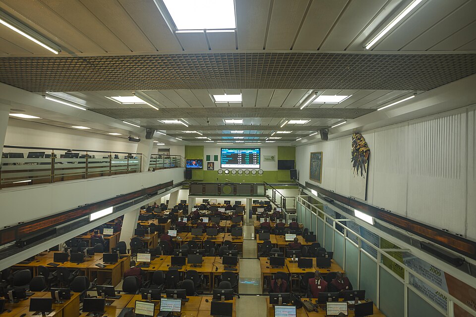
Image: Nigerian stock-exchange trading floor, September 2018. Archive photograph by S.aderogba / Wikimedia Commons, licensed under CC BY-SA 4.0. Wikimedia-provided 960px rendering; no local visual edits.
